Thông tin dự án
- Category: LOGO
- Project date: April 5, 2023
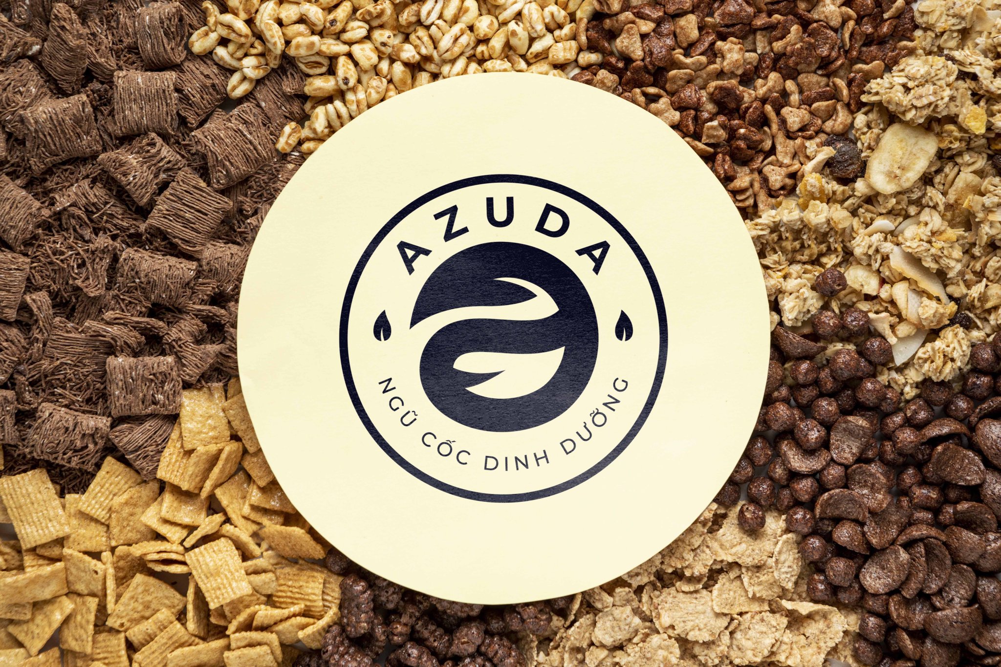
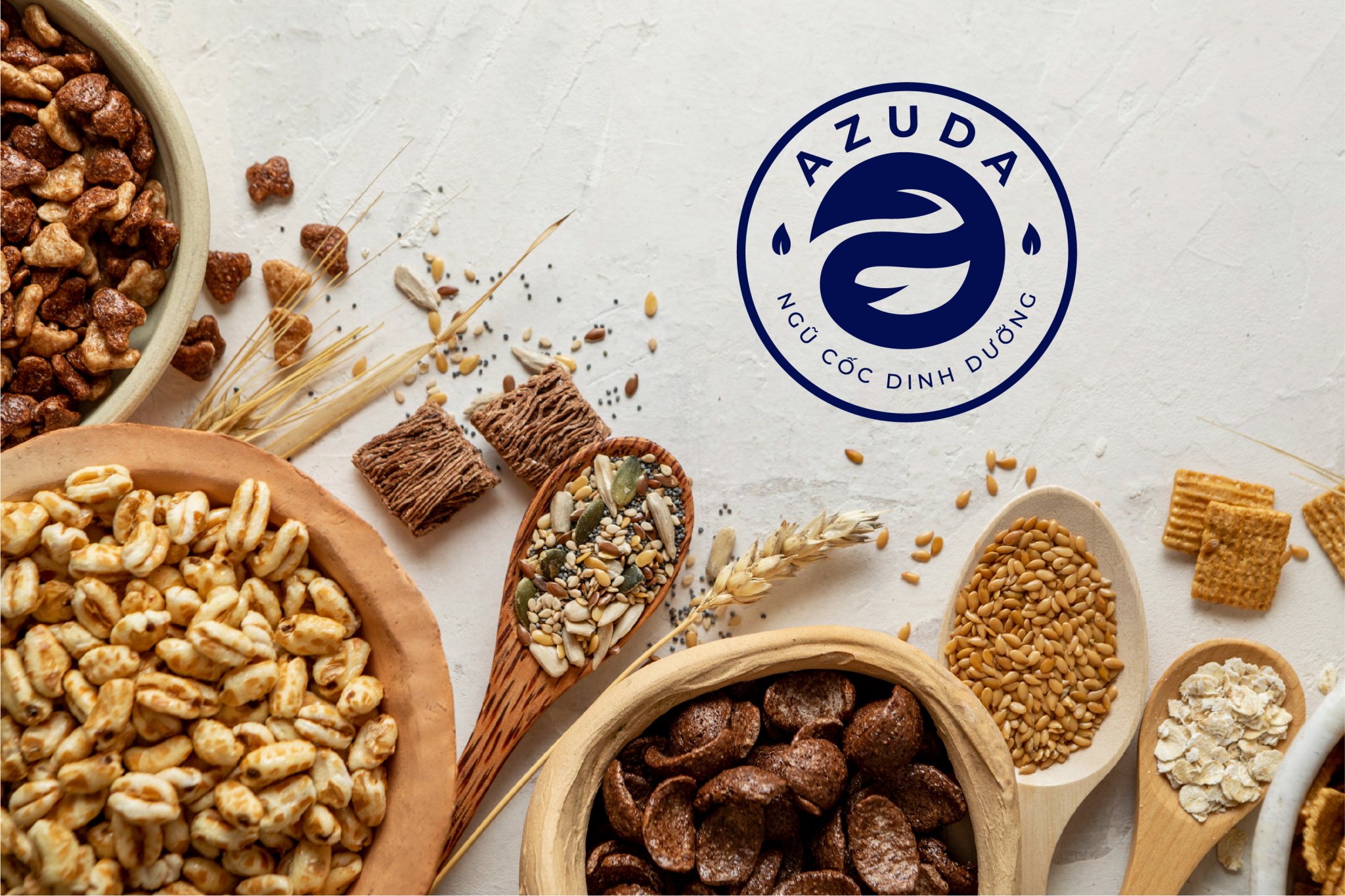
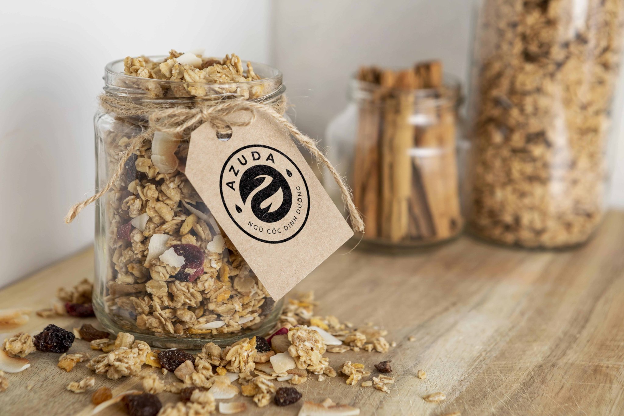
Logo Design for Aduza Nut Brand
The logo for Aduza is designed to convey the brand's essence of health, balance, and natural purity, combining the letter "a" with elegant leaf motifs.
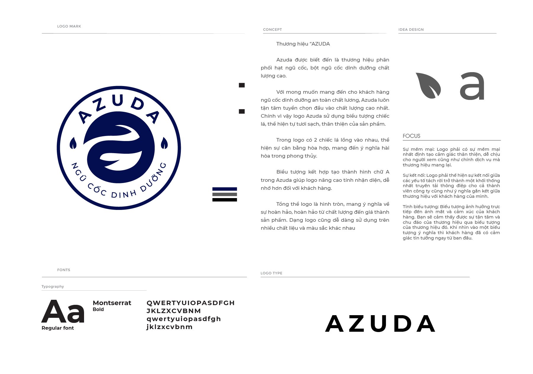
Key Design Elements:
-
Lowercase "a":
- The letter "a" is presented in lowercase, symbolizing approachability and simplicity, aligning with the brand's focus on natural and wholesome nutrition.
- Its layout within a circular frame conveys perfection, unity, and continuity, reinforcing the brand’s commitment to delivering complete and balanced products.
-
Yin-Yang Inspiration:
- The two halves of the lowercase "a" are stylized to resemble the yin-yang symbol, emphasizing harmony and balance, key values for a nutritional product.
- This design choice highlights the brand’s focus on creating equilibrium between health, taste, and sustainability.
-
Leaf Motifs:
- Two leaves are integrated into the logo, flowing in opposite directions to add a sense of grace and vitality.
- The leaves symbolize naturalness, growth, and purity, reflecting the organic essence of Aduza’s nut-based offerings.
- Their curved placement enhances the logo’s overall softness and fluidity, making it visually appealing and soothing.
-
Modern Circular Design:
- Encasing the design in a circle ensures the logo’s versatility and strengthens its symbolism of completeness and inclusivity.
- The circular shape also facilitates its use across different branding materials, from packaging to digital platforms.
-
Color Palette Suggestion:
- A natural palette, including shades of green for leaves and earthy tones, can further emphasize the brand's connection to health and nature.
The Aduza logo reflects harmony, natural purity, and modernity, capturing the essence of a brand that values health and well-being in every product.
-