Thông tin dự án
- Category: LOGO
- Project date: April 5, 2023
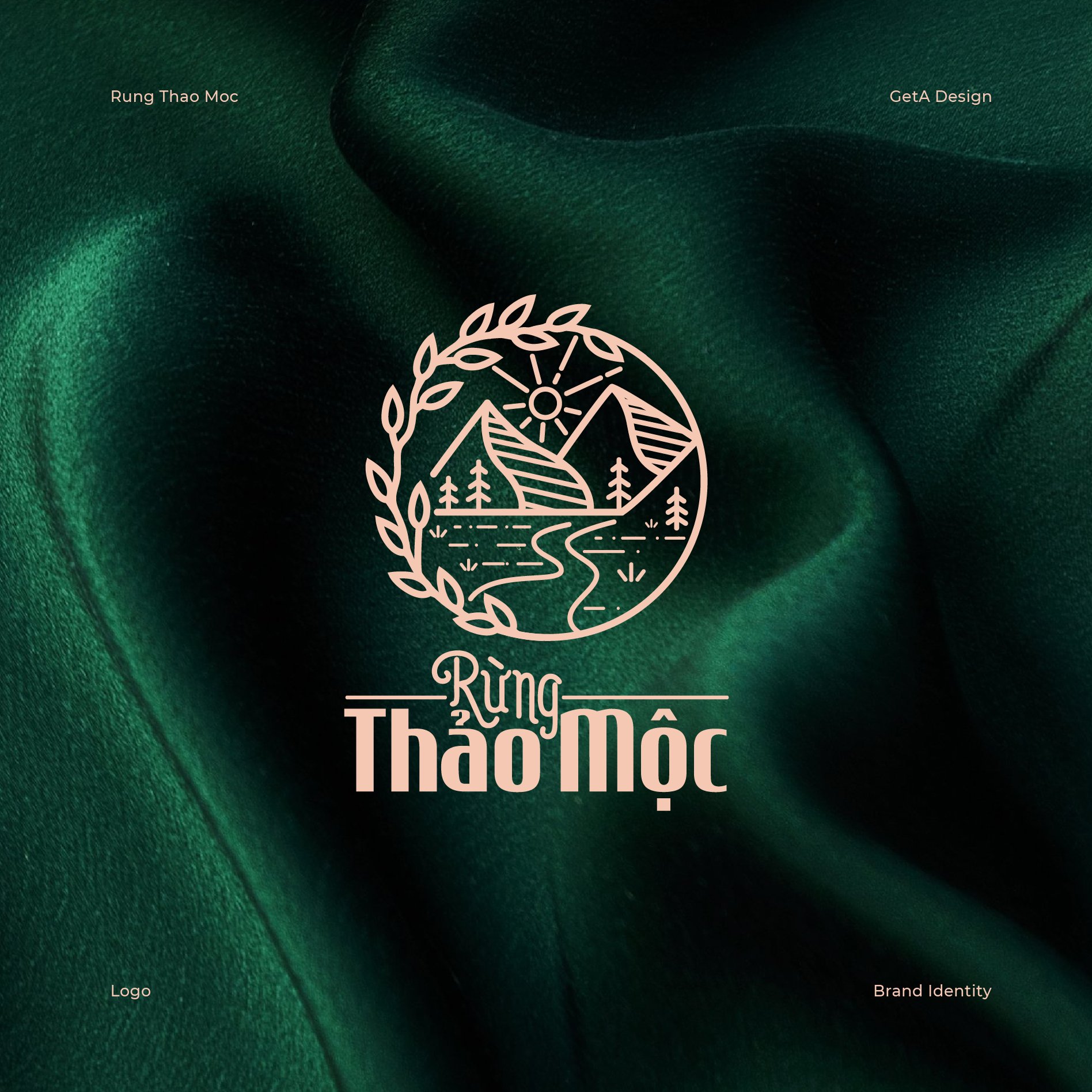
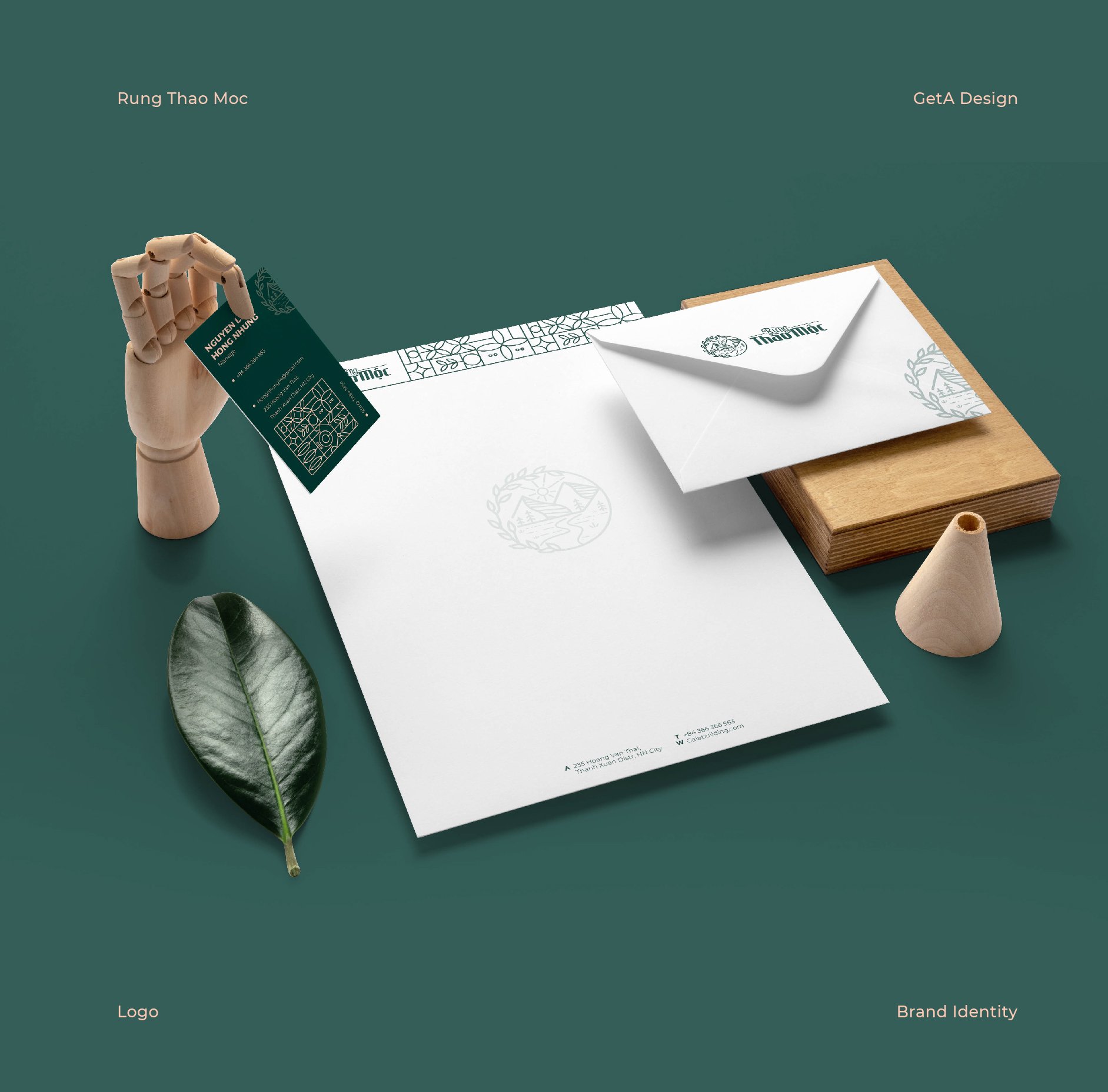
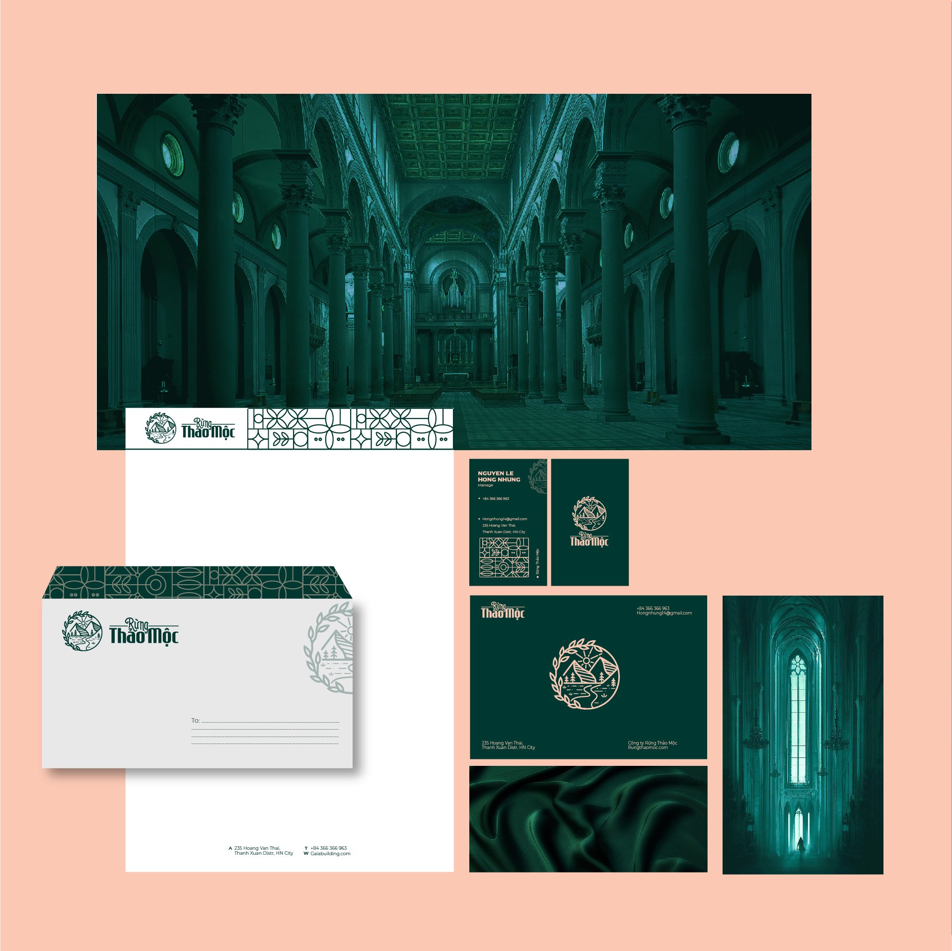
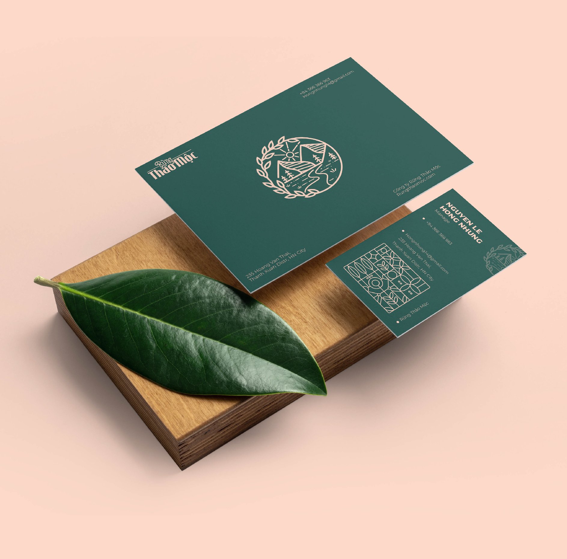
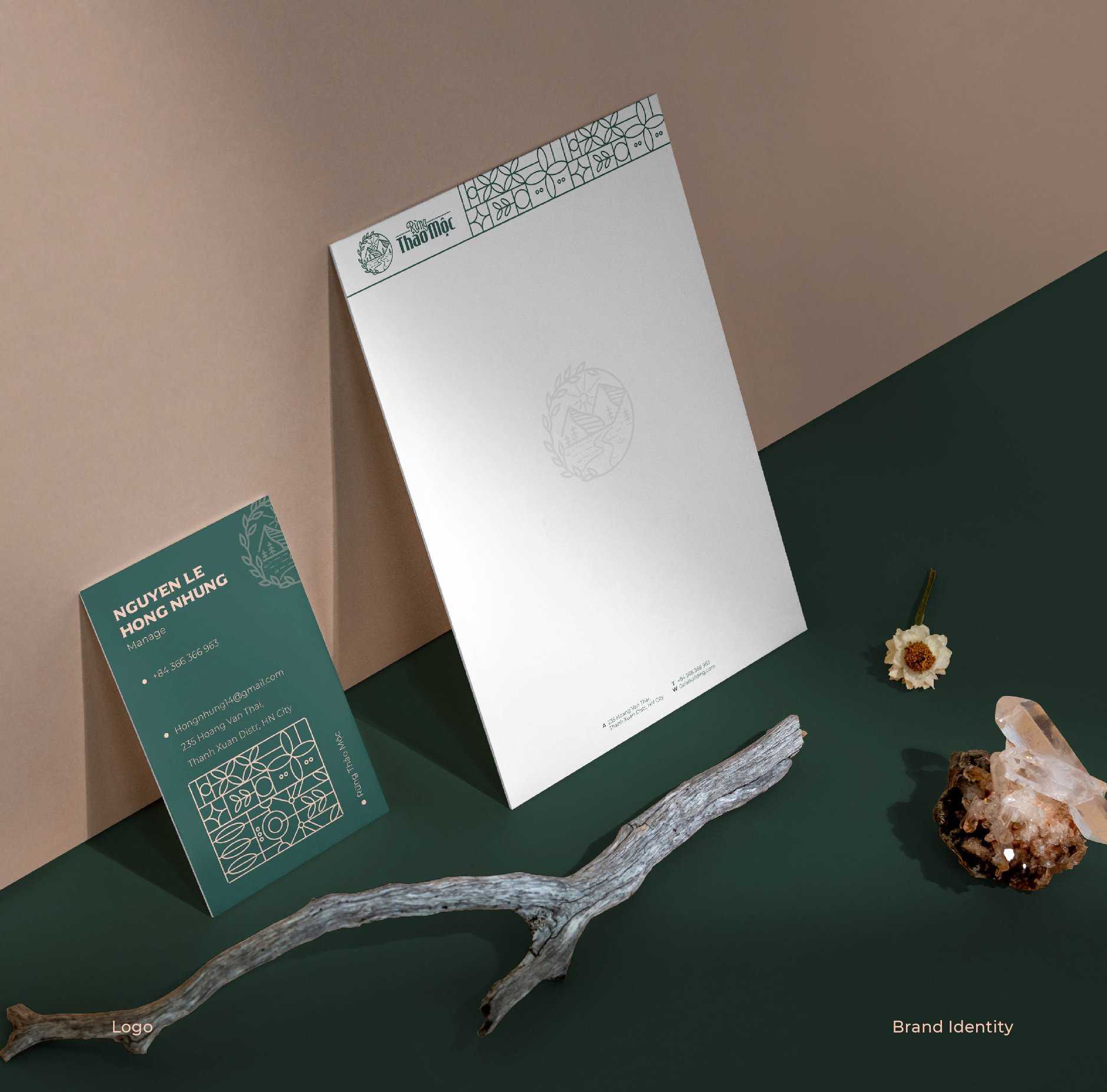
Logo Design for Rung Thao Moc
The Rung Thao Moc logo embodies the essence of natural beauty and gentle elegance, reflecting the brand's dedication to organic skincare. The design integrates elements of nature with soft, flowing lines to convey both the nurturing qualities of cosmetics and the purity of nature.
Key Design Elements:
-
Lush Branches and Leaves:
- The outer border of the logo features graceful, winding branches and leaves, evoking a sense of softness and femininity, aligning with the gentle nature of beauty products. This design element is a visual metaphor for the light, soothing texture of the cosmetics and the natural ingredients used.
- The flow of the leaves gives the logo a sense of movement and vitality, suggesting the active, rejuvenating properties of the products.
-
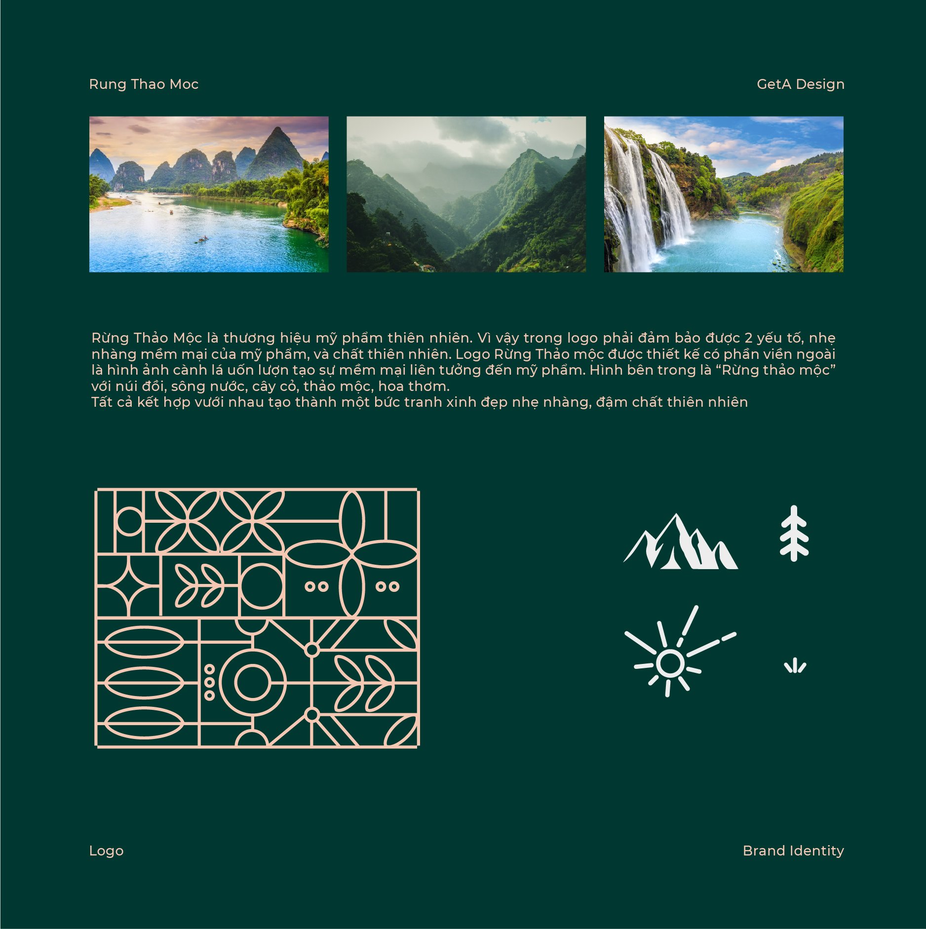
Natural Landscape Inside:
- The central part of the logo showcases a landscape of mountains, rivers, and lush greenery, symbolizing the bountiful natural world from which the products are derived. This scenic imagery conveys the brand's commitment to purity, sustainability, and the healing power of nature.
- The elements of herbs, flowers, and trees are subtly incorporated, enhancing the connection to botanical ingredients and natural beauty.
-
Soft, Flowing Typography:
- The name “Rung Thao Mocc” is designed with rounded, organic letterforms, which mirror the gentle flow of the leaves and landscape, reinforcing the feeling of nurturing and natural care.
- The typography is easy on the eyes, embodying both elegance and simplicity.
-
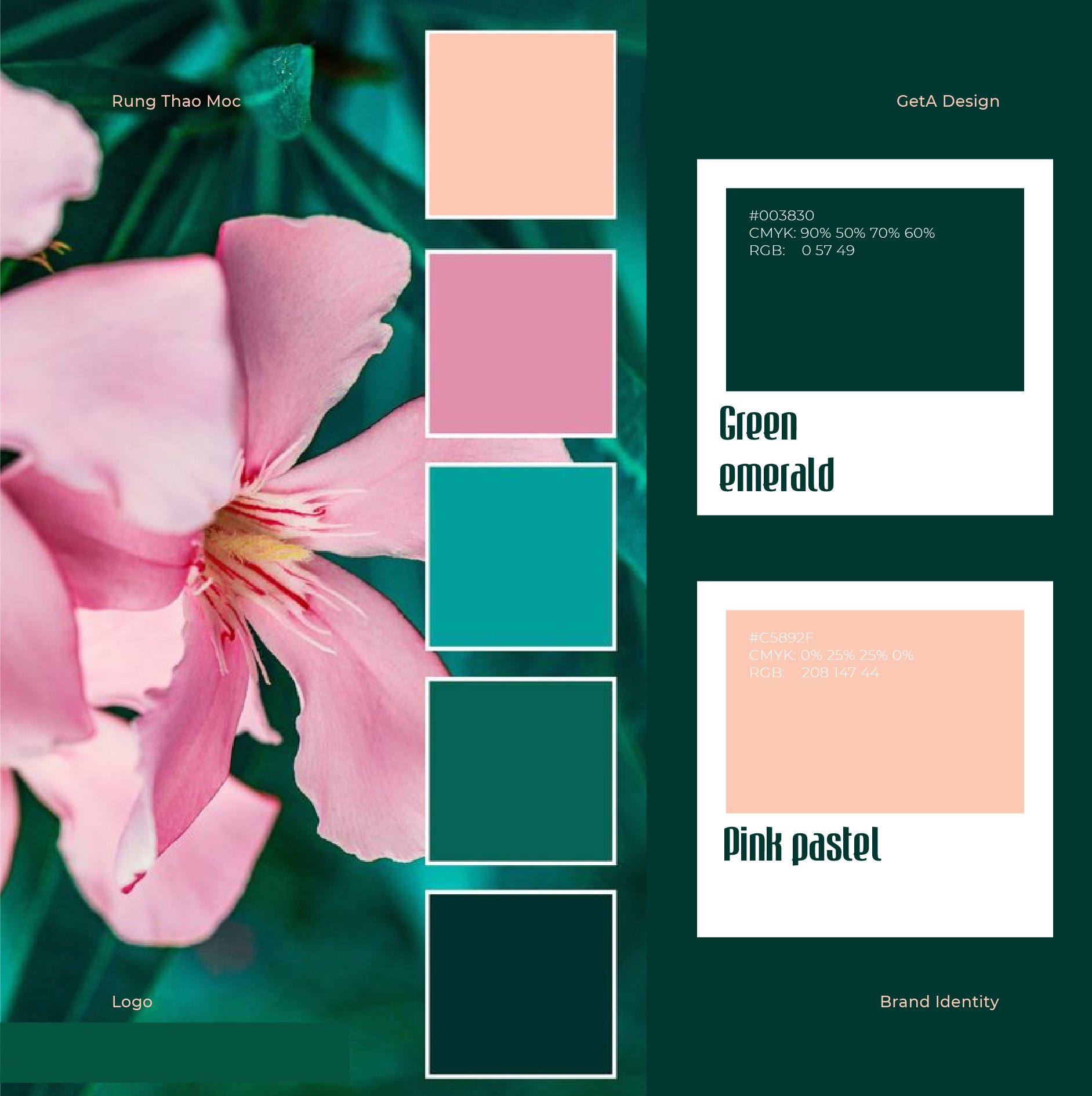
Color Palette:
- A natural color scheme of greens, earthy browns, and soft floral tones is used to evoke a sense of harmony and connection to nature. These colors reflect the freshness and purity of the ingredients used in the products.
- The soft green hues represent the natural origins of the ingredients, while the earthy browns evoke a sense of groundedness and sustainability.
-
Message of Harmony and Nature:
- The logo as a whole creates a sense of peace and balance, reinforcing the brand’s commitment to providing gentle, effective skincare derived from the earth’s purest resources.
- The seamless integration of nature’s beauty with the soft and elegant typography reflects the holistic approach to beauty, emphasizing both natural and nurturing qualities.
Brand Message:
The Rung Thao Moc logo speaks to the gentleness and purity of the brand’s philosophy, capturing the essence of natural beauty. By combining flowing, organic shapes with a peaceful landscape, the logo portrays the brand's commitment to offering high-quality skincare products that are both gentle on the skin and harmonious with nature.
-