
Thông tin dự án
- Category: LOGO
- Project date: April 5, 2023
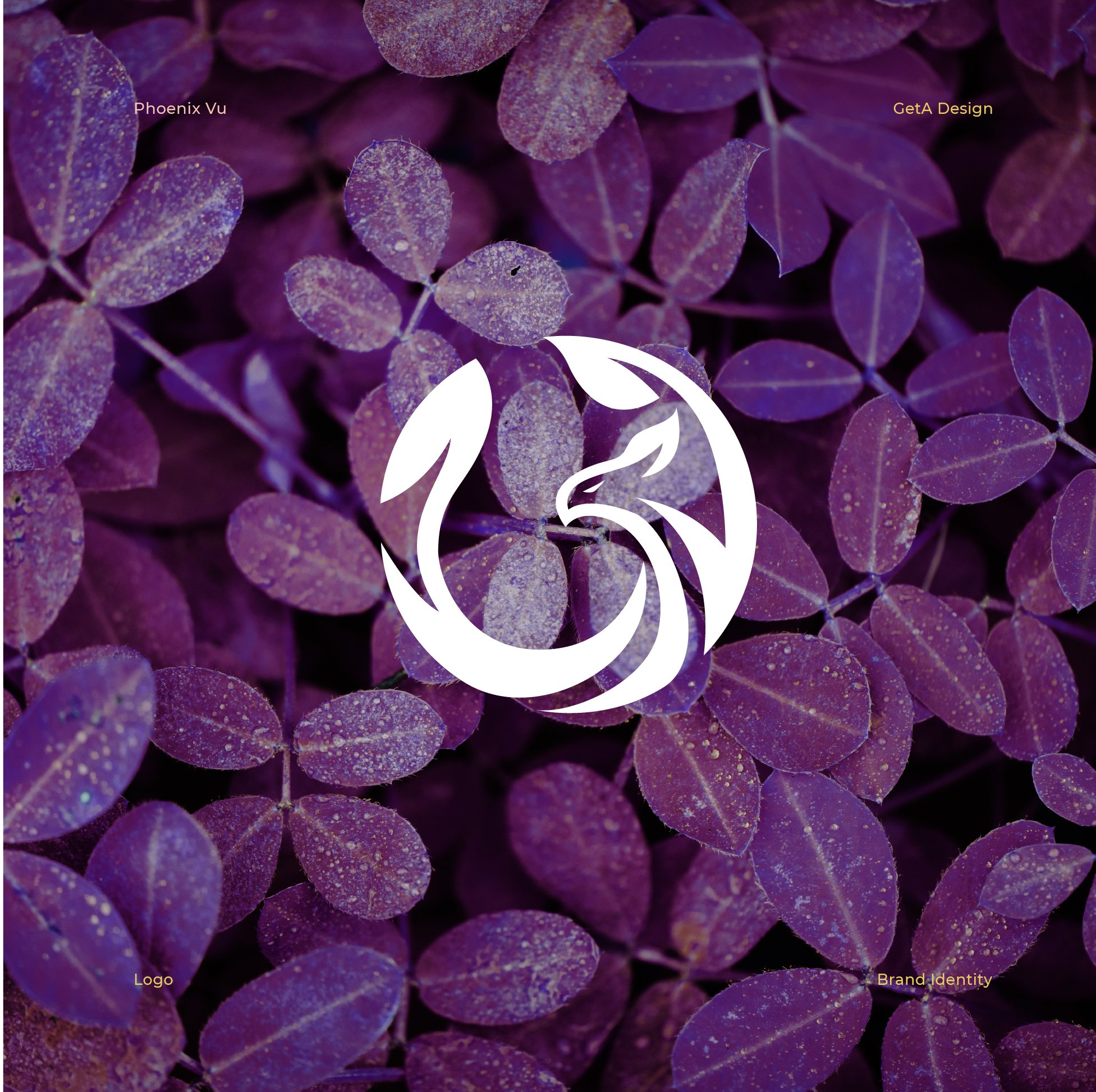
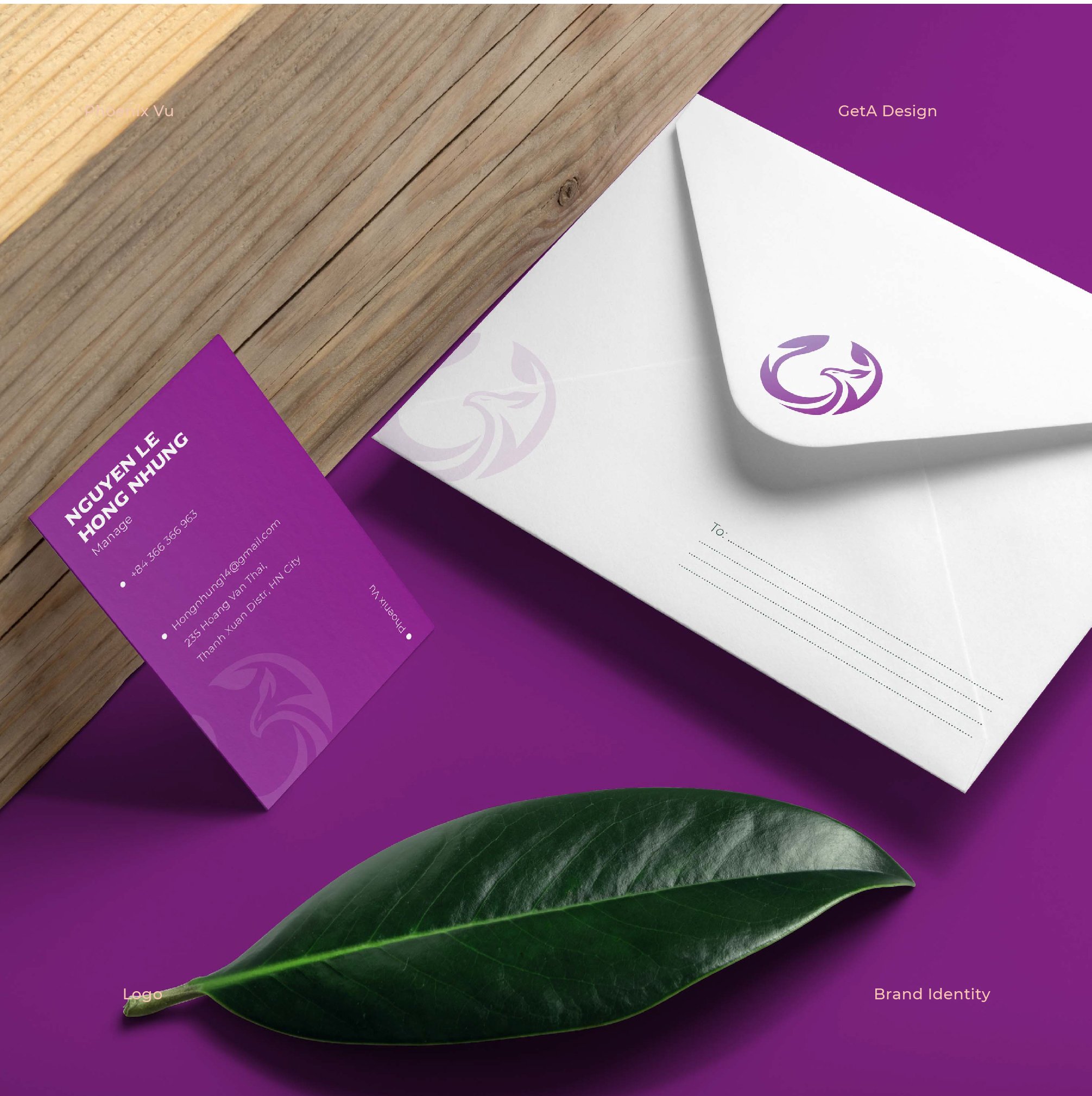
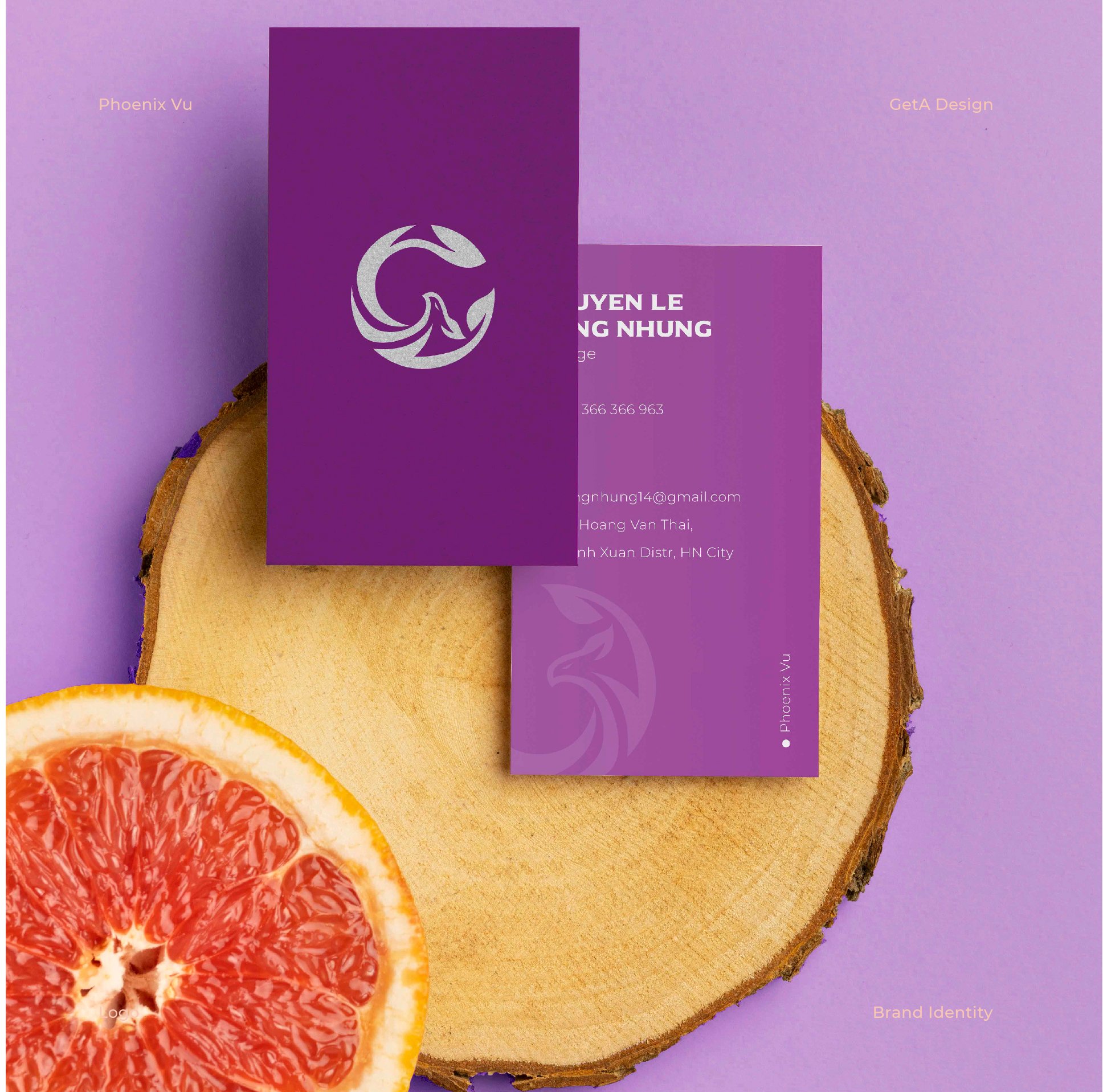
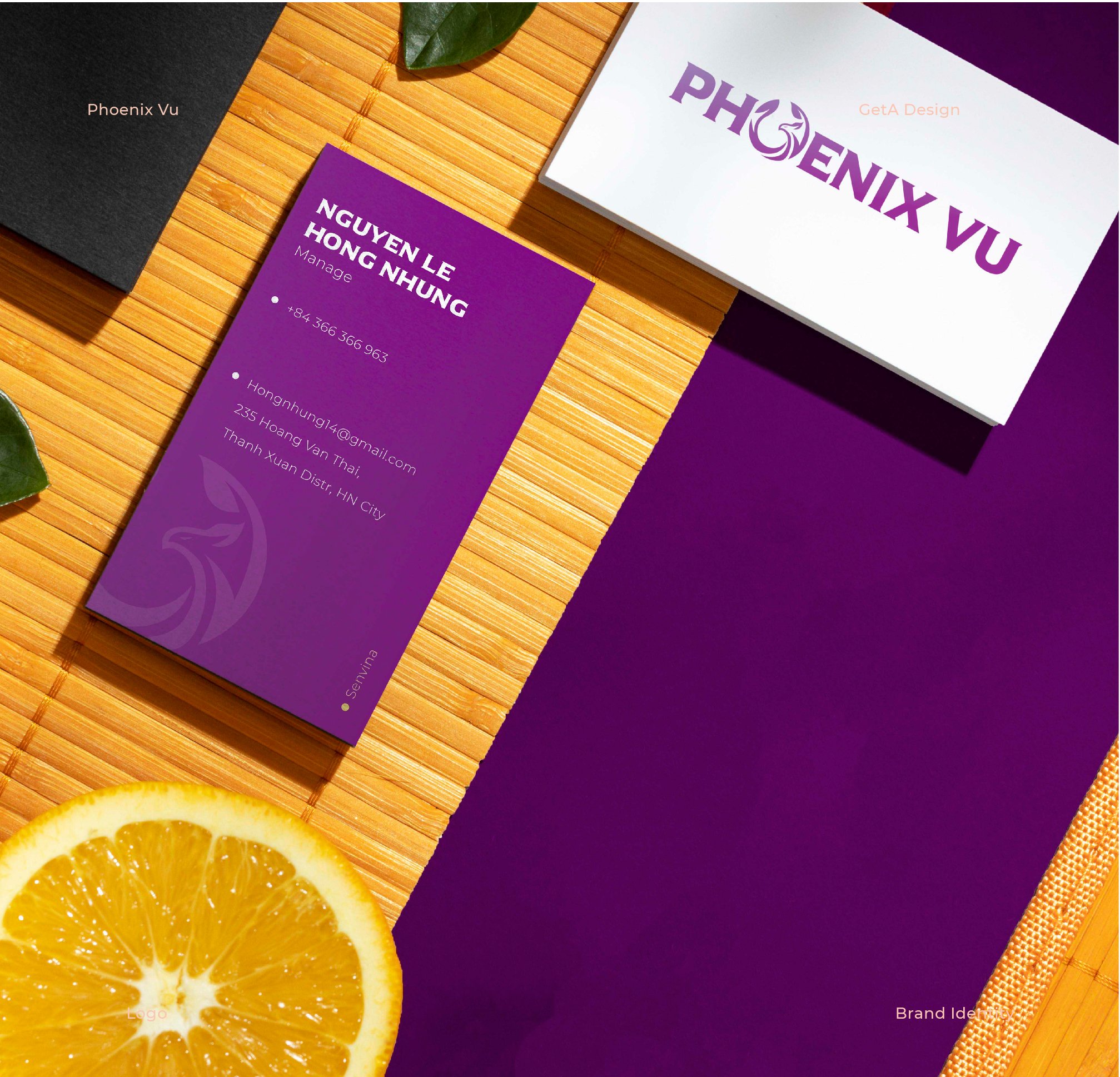
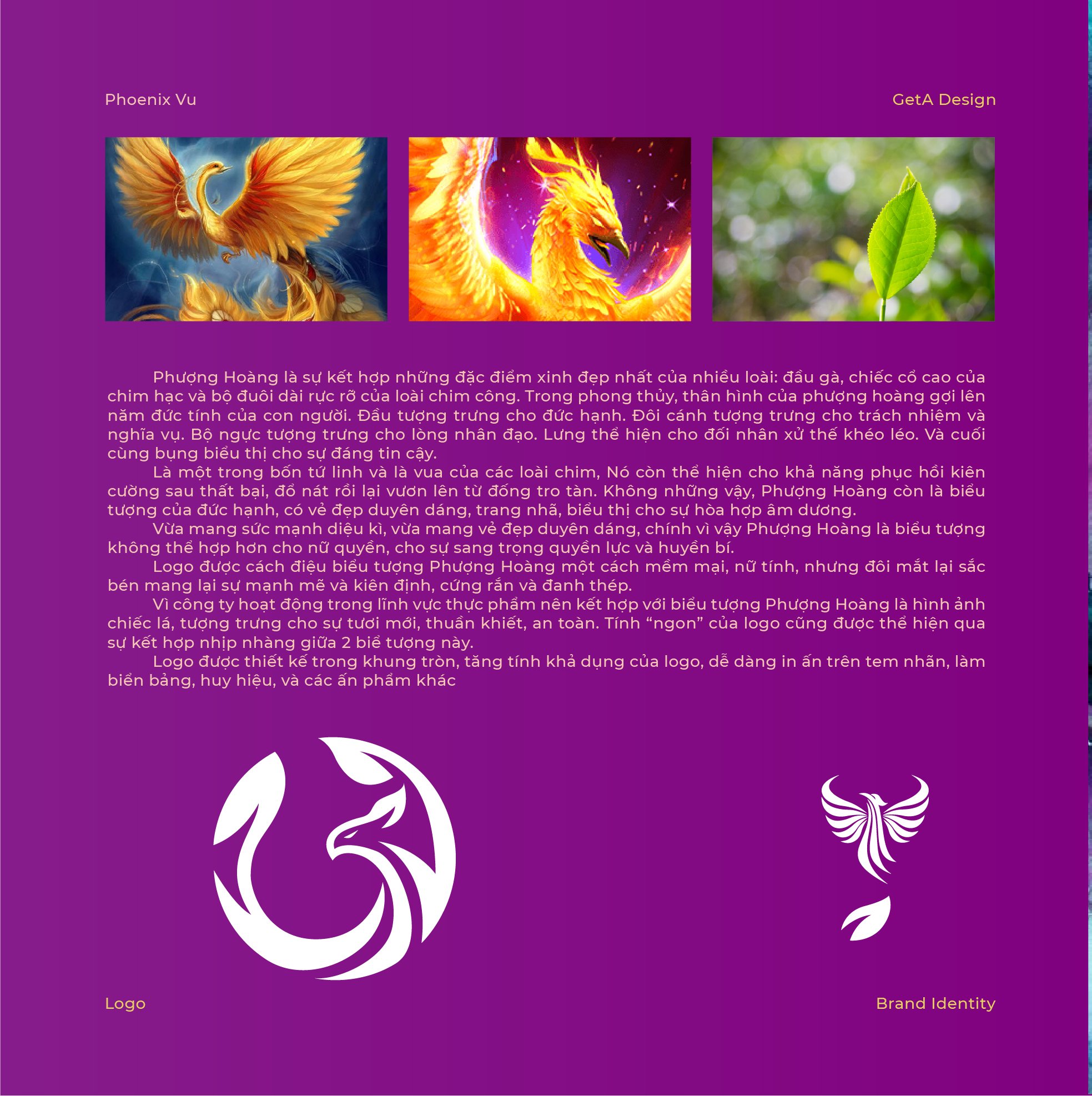
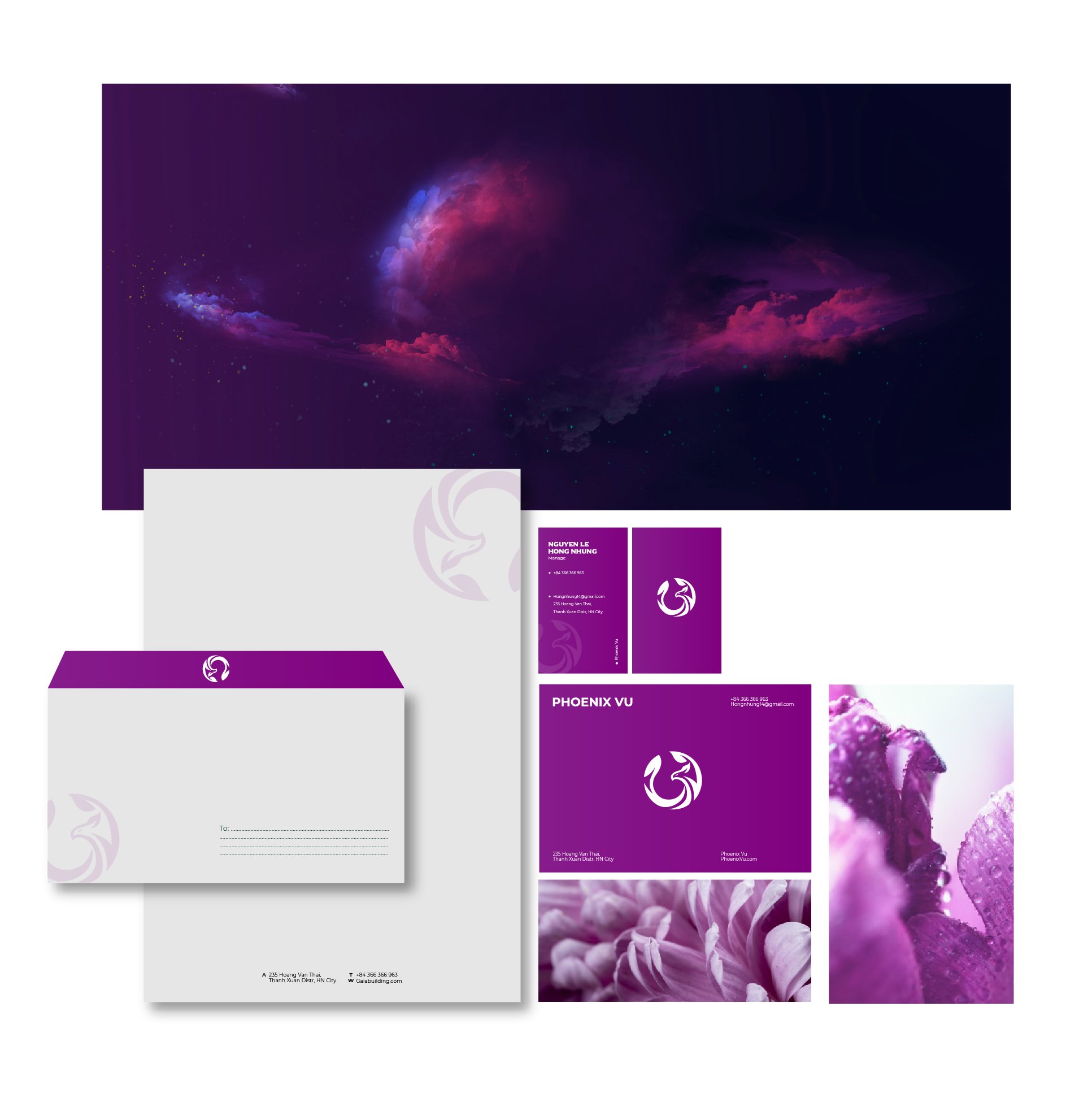
Logo Design for Phoenix V? in the Food Industry
The logo for Phoenix V? is designed with a rich symbolic foundation, seamlessly blending the majestic phoenix with elements of nature to reflect the brand's essence:
-
The Phoenix:
- The phoenix is central to the logo, representing one of the four sacred creatures and the king of all birds.
- As a symbol of resilience, rebirth, and triumph over adversity, the phoenix reflects the brand’s commitment to overcoming challenges and delivering excellence. Its elegant and regal form conveys authority and trustworthiness.
-
Leaf Elements:
- Leaves are incorporated into the design, symbolizing freshness, purity, and safety, essential qualities in the food industry.
- The softness of the leaves balances the phoenix’s powerful presence, creating a harmonious blend of majesty and approachability.
-
Circular Frame:
- The logo is enclosed within a circular frame, enhancing its versatility and usability.
- The circle represents completeness and unity, aligning with the brand’s holistic approach to delivering safe and high-quality food.
- This shape ensures ease of application across various mediums, including labels, signage, badges, and promotional materials.
-
Design Characteristics:
- The phoenix’s wings and tail are designed with flowing, leaf-like patterns, reinforcing the connection to nature and food.
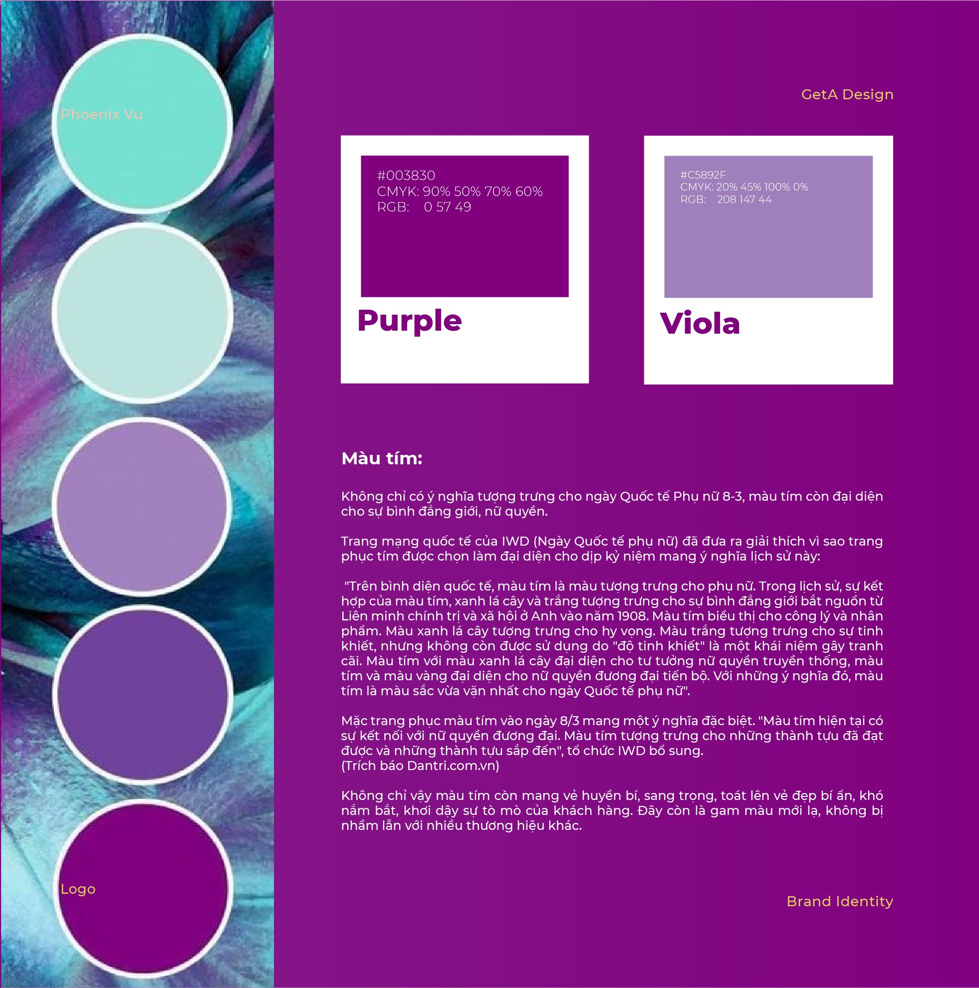
- The logo combines bold and fine strokes, balancing grandeur with subtlety. Vibrant and natural tones can be used to enhance its association with freshness and vitality.
The resulting logo embodies Phoenix V?’s core values: resilience, purity, and excellence, while offering a visually appealing and functional design for diverse branding applications.
-