Thông tin dự án
- Category: LOGO
- Project date: April 5, 2023
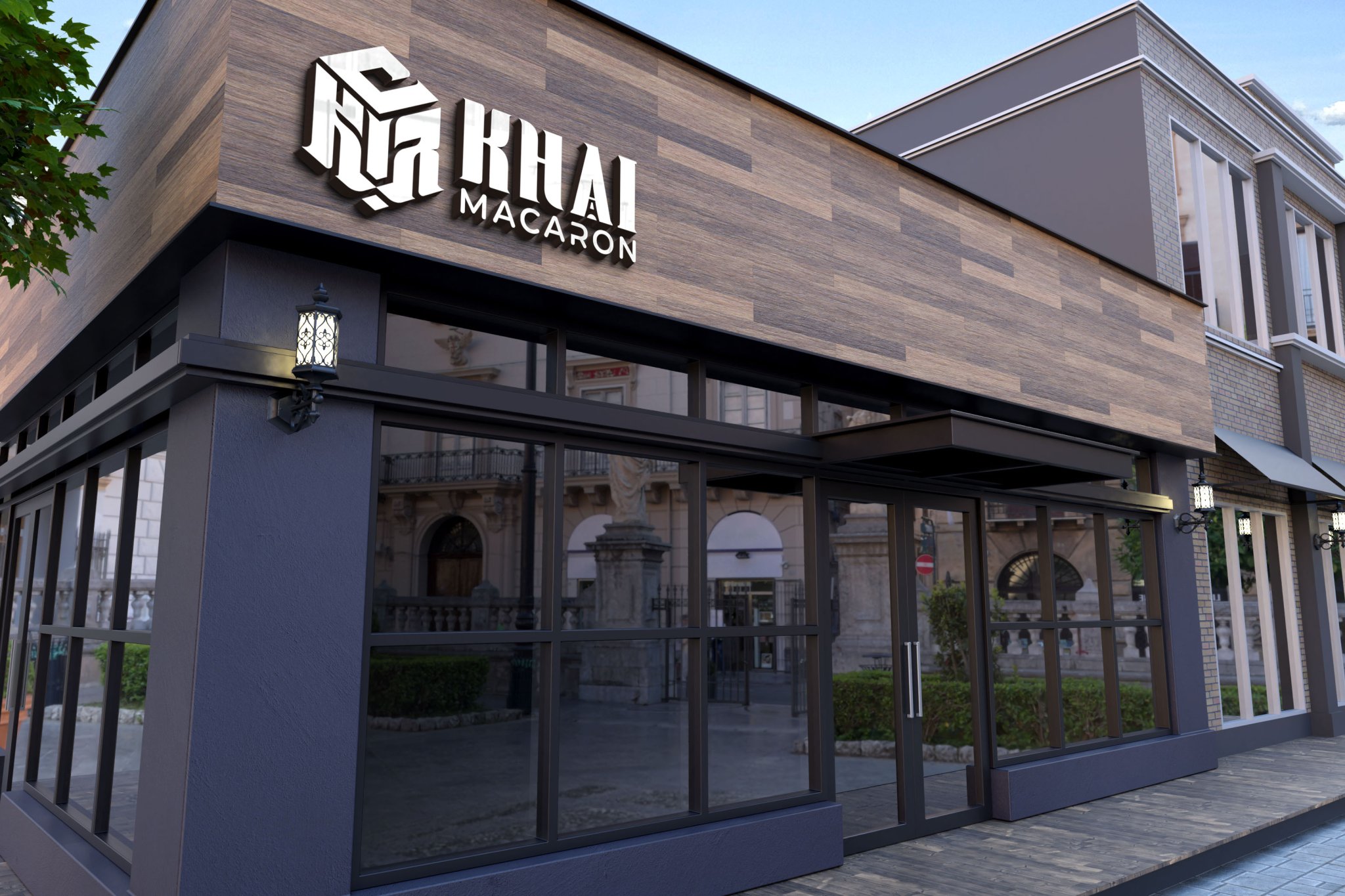
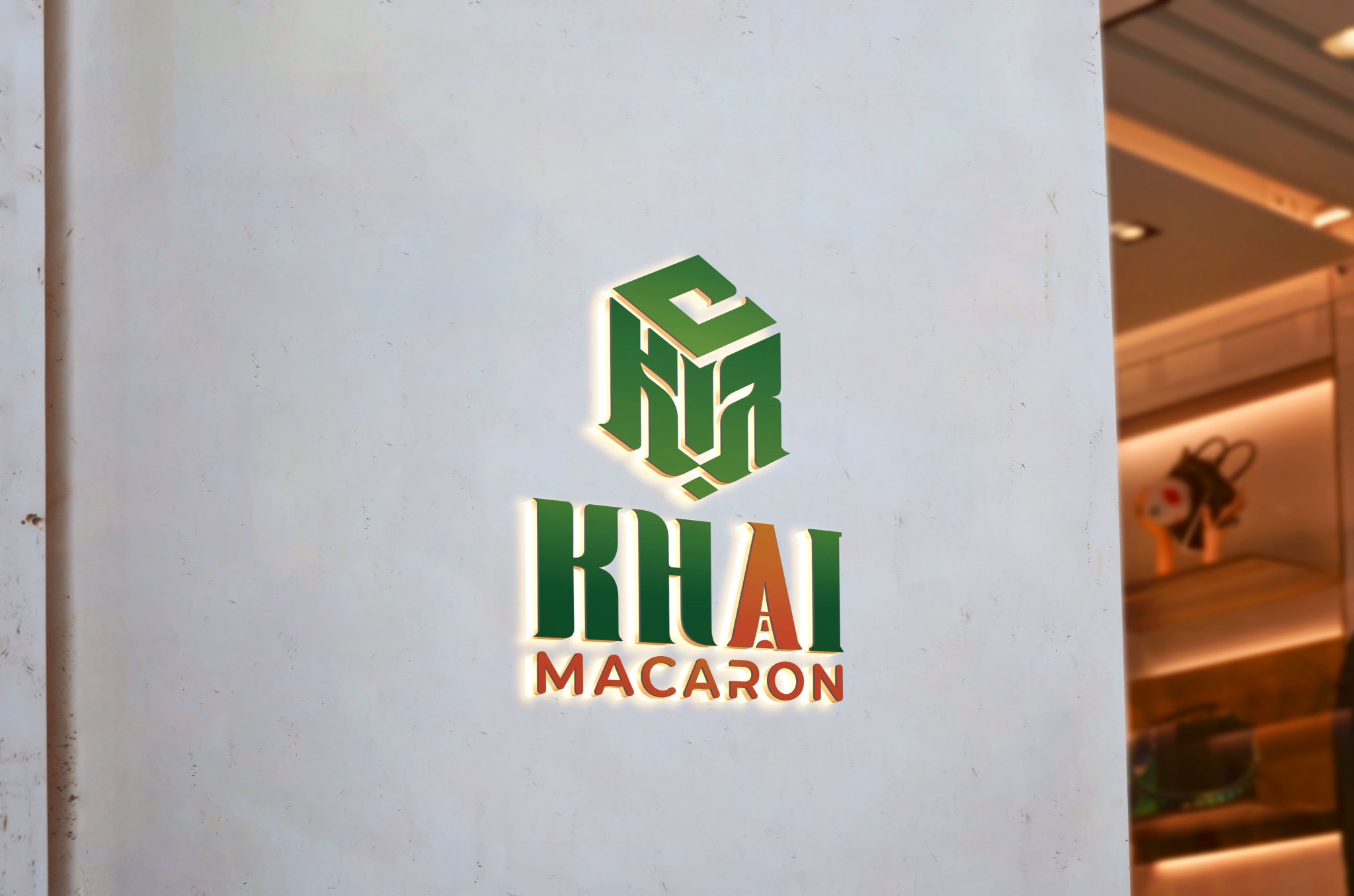
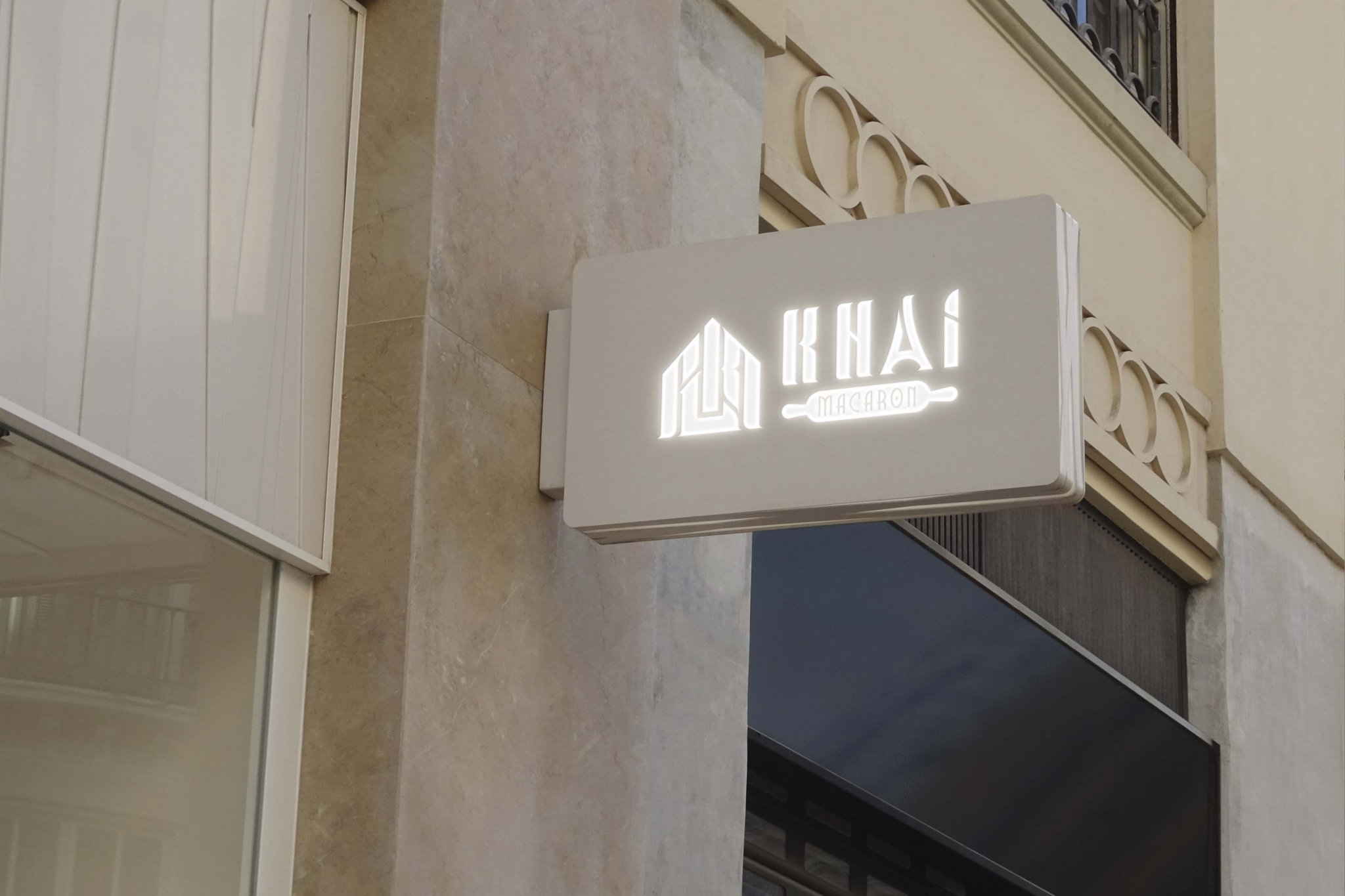
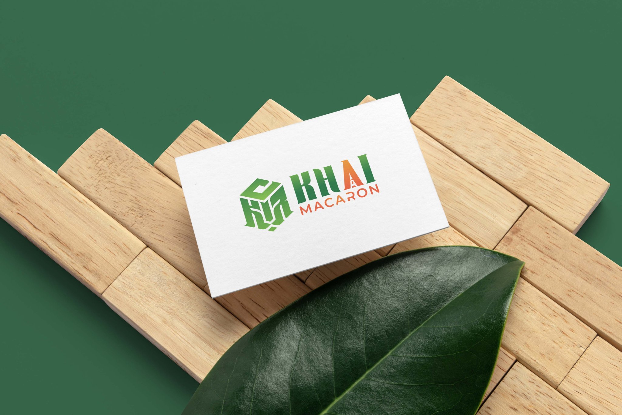
Logo Design for Khai Macaron Bakery
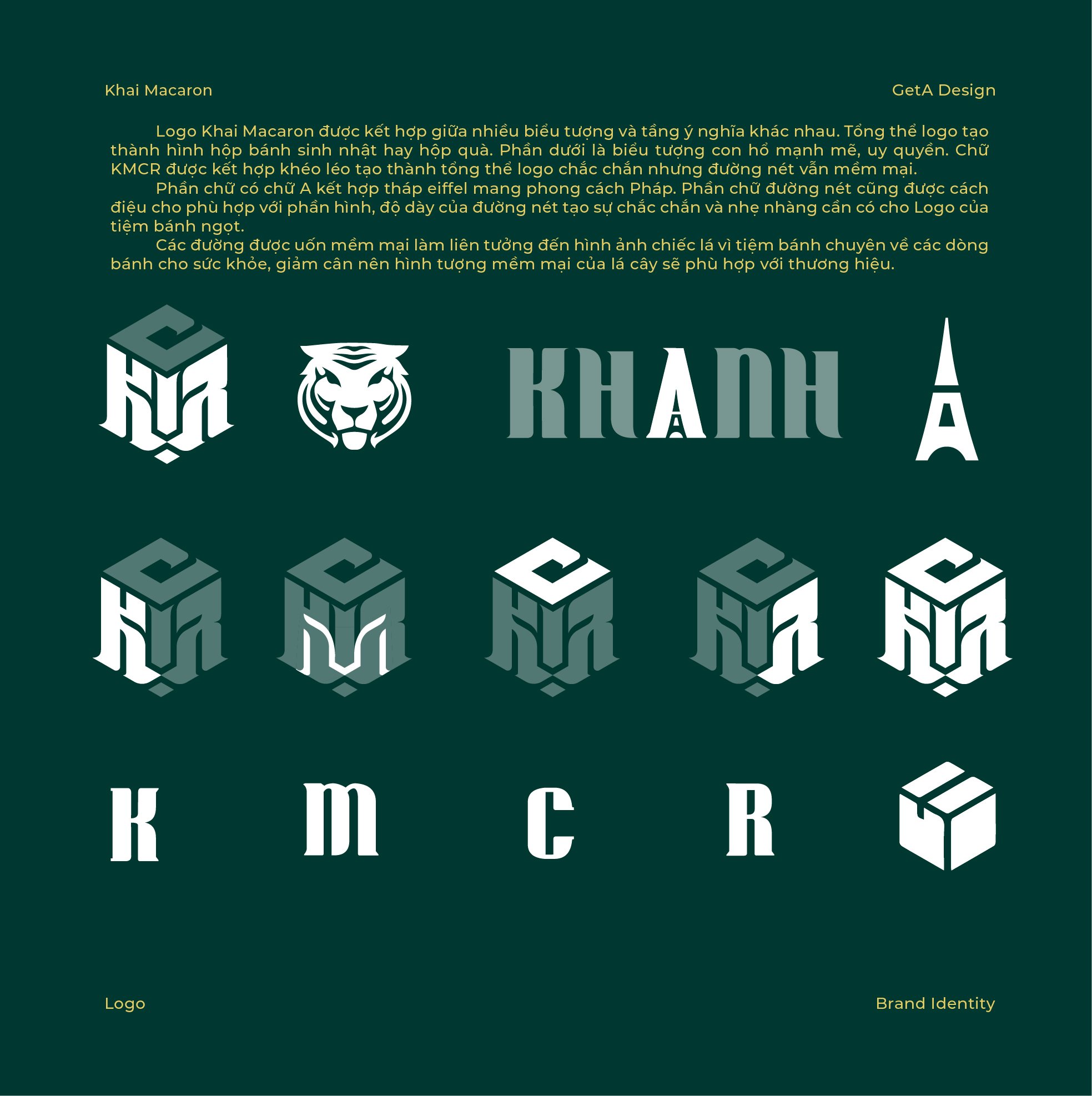
The logo for Khai Macaron is thoughtfully designed by integrating various symbols and meaningful elements:
-
Overall Concept:
The entire logo takes the shape of a birthday cake box or a gift box, representing celebrations, joy, and the bakery’s specialty in delightful treats. -
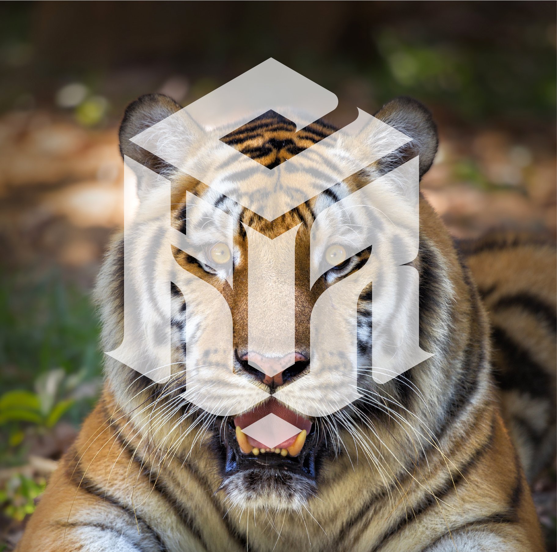
Tiger Symbol:
The base of the logo features a majestic tiger, symbolizing strength, authority, and uniqueness, reflecting the brand's bold character and distinctive flavors. -
KMCR Typography:
The letters "KMCR" are creatively arranged to form a cohesive and sturdy logo structure. Despite its solid form, the design incorporates soft curves to maintain a balance of elegance and sweetness. -
Eiffel Tower in the Letter "A":
The letter "A" is designed to resemble the Eiffel Tower, bringing a French flair to the logo. This symbolizes the authenticity and sophistication of French-inspired macarons, aligning with the bakery's premium offerings. -
Soft, Leaf-Like Curves:
The logo's curves evoke the image of delicate leaves, symbolizing health and wellness. This element highlights the bakery's focus on healthier, weight-friendly dessert options, adding a sense of care and lightness to the brand's identity. -
Balanced Lines and Proportions:
The overall design harmonizes thick and thin strokes, achieving a perfect blend of stability and softness. This balance reflects both the reliability and charm of Kh?i Macaron’s sweet creations.
The result is a versatile and meaningful logo that conveys celebration, elegance, health-conscious values, and the bakery’s connection to French pastry artistry.
-

