Thông tin dự án
- Category: LOGO
- Project date: April 5, 2023
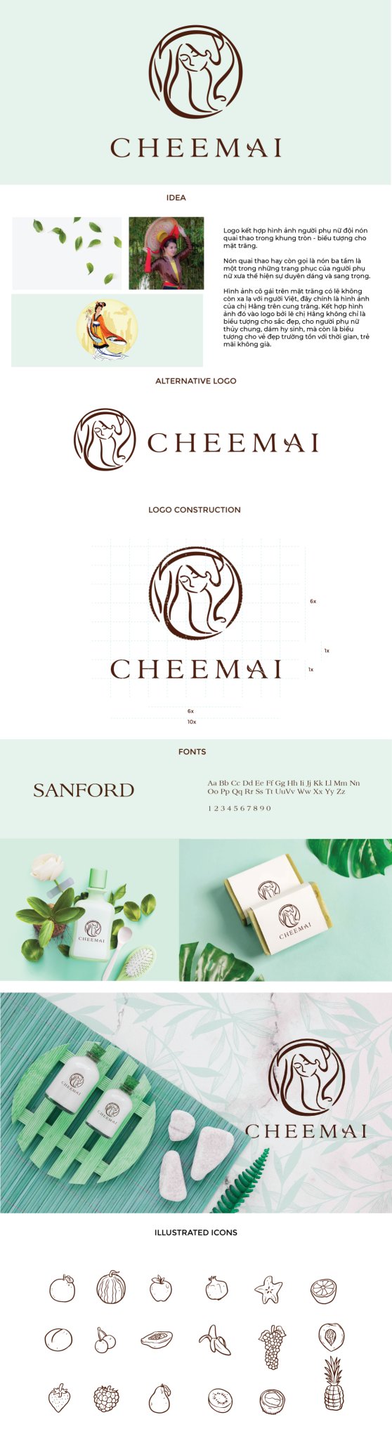
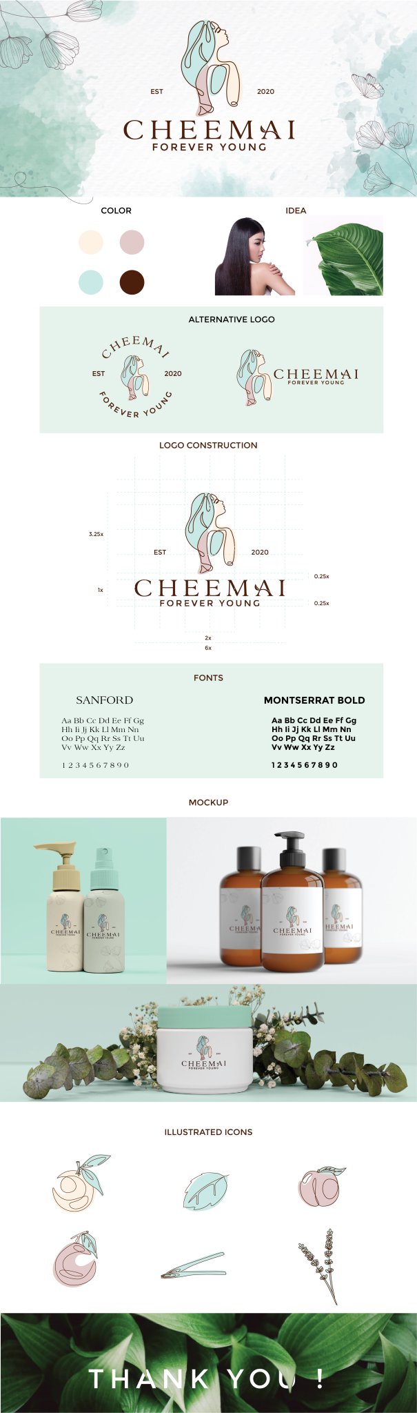
Logo Design for Cheemai
The Cheemai logo is crafted to reflect the brand’s identity as a natural skincare brand with a focus on gentleness, femininity, and simplicity. The design combines artistic line art with natural elements to embody both the beauty and purity of the products, while maintaining a minimalistic and elegant aesthetic suitable for various applications.
Key Design Elements:
-
Line Art Representation of a Woman:
- The central figure in the logo is a stylized woman depicted using line art, which is both artistic and modern. The simplicity of the line art creates a soft and gentle appearance, capturing the feminine essence of the brand.
- The woman’s face is subtly suggested with smooth, flowing lines, leaving room for interpretation, creating an air of mystery and elegance.
-
Leaf Hair Element:
- The most striking feature of the design is the woman’s hair, which is crafted as a soft, flowing leaf. This symbolizes the brand’s natural ingredients and its connection to the earth. The leaf-shaped hair adds a wholesome, organic touch, reinforcing the concept of nourishment and care.
- The leaf’s smooth curves tie into the idea of delicacy, aligning perfectly with the brand’s emphasis on natural beauty and the nurturing power of nature.
-
Minimalist Design:
- The logo focuses on simplicity, with clean lines and subtle details, ensuring the design remains elegant and uncluttered. The minimalist style makes it suitable for easy reproduction on product packaging, labels, and other marketing materials.
- The absence of excessive detail ensures the logo’s timeless appeal, adaptable to a wide range of mediums without losing its visual impact.
-
Typography:
- The brand name, “Cheemai”, is presented in simple, refined typography, which complements the minimalist aesthetic of the line art. The letterforms are elegant but straightforward, with soft curves to maintain the feminine and gentle vibe.
- The typography is integrated in a way that doesn’t overpower the line art but enhances its beauty, ensuring harmonious balance in the design.
-
Color Palette:
- The color scheme is subtle and natural, using soft, earthy tones such as gentle greens, creamy whites, or light pastel hues. These colors evoke a sense of purity, freshness, and calm, aligning with the brand’s focus on natural, eco-friendly products.
- The colors are chosen to be versatile, ensuring the logo maintains its impact on various backgrounds and packaging materials.
-
Consistent Brand Identity:
- The logo’s clean and simple design allows it to be used consistently across all product lines and marketing materials, maintaining a cohesive brand identity.
- The line art style and leaf motif can be easily adapted to various formats, from small product labels to large-scale displays, ensuring the logo remains recognizable and effective.
Brand Message:
The Cheemai logo conveys the brand’s commitment to natural beauty, simplicity, and femininity. Through its elegant line art design and natural motifs, it represents a harmonious balance between art and nature. The leaf-shaped hair of the woman symbolizes the nurturing qualities of the brand’s products, while the clean, minimalist aesthetic ensures that the logo is timeless, versatile, and easy to recognize across various mediums.
-